curatorprojecten / curatorial projects
|
|
|
- Mathilda Mulder
- 4 jaren geleden
- Aantal bezoeken:
Transcriptie
1 FMC 08 1
2 2
3 index voorwoord / preface artists in residence residents 2008 werken / works Post-it Obama for president curatorprojecten / curatorial projects projecten / projects Tapetenwechsel/Change of Scenery Woord & beeld, hout & loof Word & image, wood & leaves Cakehouse in a Smurph Holl Peripheral Press: Love - Death - Life - Soul Transbordement Samenwerkingsverbanden / collaboration alliances workshops tentoonstellingen / exhibitions colophon 4, , , , ,
4 Voorwoord Beste lezer, In 2008 is het Frans Masereel Centrum (FMC) een nieuwe richting ingeslagen. De organisatie wil een elan van openheid, kwaliteit en diversiteit nastreven, en dit op een professioneel ondersteunende en georganiseerde manier. En hierop doorgaan uiteraard. Dat het FMC ervoor ijvert haar werking een kwaliteitsvolle uitstraling te geven, behoeft geen betoog. Het element diversiteit toont zich dan weer in de verscheidenheid aan kunstenaars die deel uitmaken van onze receptieve werking, alsook op het niveau van de organisatie. Tekenend voor het streven naar openheid ten slotte, zijn onder meer de samenwerkingsakkoorden met FLACC (Genk) en Jan van Eyck academie (Maastricht). Het belangrijkste uithangbord van de openheid is echter het curatorproject. Dit project heeft tot doel om jonge curatoren aan te trekken met het oog op de organisatie van een grafisch totaalproject met interessante beeldende kunstenaars. Hiermee reikt het FMC de hand naar elke beeldend kunstenaar die een grafisch project of idee wil realiseren. Voortaan krijgt iedere kunstenaar de kans om een dossier in te dienen en in de nodige ateliers aan de slag te gaan met professionele ondersteuning. Het educatieve luik, dat een belangrijk onderdeel vormt van de activiteiten van het FMC, is erop gericht studenten en kunstenaars, maar ook het grotere publiek inzicht te verschaffen in het grafisch medium en de werking van het centrum. Voor Hogere Kunststudenten is er een vaste periode voorzien waarin samenwerking tussen nationale en internationale kunsthogescholen sterk gepromoot wordt. Via workshops worden meer technische aspecten en manieren van conceptontwikkeling in Grafiek gedemonstreerd en onderzocht. Het grotere publiek op haar beurt wordt betrokken door middel van tentoonstellingen en andere activiteiten in en buiten het FMC. Essentieel in de werking van het FMC is enerzijds dat alle deelnemers op een autonome manier aan de slag moeten kunnen gaan en anderzijds dat hun een optimale residentie en werkverblijf worden aangeboden om zich in het grafisch medium en het eigen werk te verdiepen. Ook het leggen van nieuwe contacten met de vele andere kunstenaars die tijdens een residentieperiode aanwezig zijn, biedt de kunstenaars een uitgelezen kans om zich verder te ontwikkelen. Op organisatorisch niveau streeft het FMC synergieën met andere actoren na teneinde de mogelijkheden om nadien ook elders aan de slag te gaan te optimaliseren voor onze Vlaamse kunstenaars. Zowel nationaal als internationaal blijft een waaier aan opportuniteiten immers dikwijls onaangeroerd. Dit is vooral te wijten aan de onwetendheid over het potentieel binnen de Artist in Residences, waarin het FMC een niche bekleedt. Gedurende 36 jaar heeft het FMC zich hierin weten te specialiseren, waardoor het een uniek expertisecentrum is geworden. Met het huidige jaarverslag wil het Frans Masereel Centrum (FMC) ook u graag een blik gunnen op de werking van de organisatie, en meer concreet op de activiteiten en realisaties van Het overzicht dat u hier terugvindt reflecteert de nieuwe richting die dit centrum is ingeslagen en die het in de toekomst zal volgen om zich verder te profileren. Graag maak ik ook van de gelegenheid gebruik om de leden van de stuurgroep en de selectiecommissie, alsook de medewerkers van het FMC, uitdrukkelijk te bedanken voor de inzet en het enthousiasme zonder dewelke het FMC nooit de succesvolle werking zoals het die nu kent, had kunnen realiseren. 4
5 Preface Dear Reader: The Frans Masereel Centre (FMC) has taken a new direction in The organisation aims for a new course defined by openness, quality, and diversity, which is to be pursued in a professionally sound and organised manner. The FMC is devoted to bring a distinctive quality to its working. The element of diversity is apparent in the variety of artists included in our receptive activities, as well as within the organisational structure itself. The collaboration agreements with FLACC (Genk) and the Jan van Eyck Academy (Maastricht), are significant in this sense. The most important exponent of openness is, the curatorial project. This project aims to invite young curators to organise a comprehensive printmaking project in collaboration with outstanding visual artists. In this way, the FMC reaches out to artists wishing to realise a graphic project or idea. From now on, artists will be given the opportunity to submit a proposal and realize projects with professional assistance. The educational part, an important aspect of the FMC activities, aims to provide students and artists, as well as the greater public, with a clear insight into the graphic discipline and the working methods of the centre. There is a period planned for art graduates wherein collaboration between national and international art schools is intensively promoted. Technical aspects and various approaches of conceptual elaboration in the graphic arts are investigated and demonstrated in workshops. The participation of the greater public is invited through exhibitions and other activities in and around the FMC. It is of seminal importance to the structure of the FMC that all participants be given the opportunity to operate in an autonomous manner and enjoy an optimum residency and working stay enabling them to concentrate on both the graphic medium and their own artwork. The possibility to establish new contacts with the many other artists present during a residency period gives the participants a unique opportunity for further development. On an organisational level, the FMC seeks to establish synergies with other institutions in order to optimise working possibilities for Flemish artists abroad. A wide range of both national and international opportunities are often neglected. This is mainly due to a lack of knowledge of the possibilities within the Artist in Residences programmes, in which the FMC is a main niche player. For 36 years the FMC has been specialising in said programme, and has grown into a unique centre of expertise. With this current annual report, the Frans Masereel Centre (FMC) invites you to take an inside view into the workings of the organisation, more specifically the activities and realisations of The overview you will find here reflects the new direction this centre has taken and will continue to follow in the future to further sharpen its profile. I wish to seize the opportunity to expressly thank the members of the advisory committee and the selection committee, as well as the FMC staff, for their dedication and enthusiasm without which the FMC would never have been able to bring itself up to the present successful working level. Jan Verlinden Afdelingshoofd - Head Manager 5
6 6
7 ARTISTS IN RESIDENCE
8 8
9 AUSTRALIË Van de Maele Peter Walsh Jade BELGIË Bellers An Beyens Carine Billet Greet Bogaerts Annemie Ceulemans Els Cleeren Colette Cleeren Luce Coolen Caroline Delrue Ronny d O Honoré Geyskens Vincent Gillen Tina Goussey Roel Martens Joris Matyn Michèle Opsomer Geert Peeters Goedele Reggers Steve Rooms Veerle Segers Lieven Vansant Karolien Vermeersch Pieter BRAZILIË Carvalho Josely Carvalho Antonio Claudio CANADA Dinan-Mitchell cynthia Oneschuk Sarah Wozniakowska Kamila DUITSLAND Berkmann Marcus Deeg Daniela Kirsten Jean FRANKRIJK Felga Céline IERLAND Dunphy Niamh INDONESIË Achjadi Diyan ISRAEL Shenbrot Michael Yanai Guy JAPAN Kuniko Tadokoro Ote Satoshi Oyama Emiko Tsuritani Kouki LITHOUWEN Bondare Liena NEDERLAND Eylem Aladogan Hanselaar Marcella Loerakker Bert Marwick Michael Rikken Kim Rutten Marion Van Der Bruggen Noor NIEUW-ZEELAND Harley Peddie Van Hasselt Janna PERU Bedriana Tania POLEN Cywicki Janusz Lucas PORTUGAL Palma Margarida RUSLAND Zarovnaya Natalia SPANJE Suarez Fernandez Carlos TURKIJE Özmenoglu Ardan VERENIGDE STATEN Adams Erika Alaeff Romeo Blazina Jennifer Bork Dustyn Boyce Kit Brimer sean Cole Teresa Dalcerro Michael Fraleigh Angela Godollei Ruthann Goethel Campbell susan Hosford Mark Joseph Louis Kaplan Alysia Kim Eunice Lollis Cynthia Lyons Beauvais Mc Dermott Dave Panske Gail Pike Sarah Poskovic Endi Robinson Mary Segal Adi Swainston Rob Thorsten Dennerline Art Werger ZIMBABWE Coster Mkoki ZUID-AFRIKA Geers Kendell Hoffman Jeanne Sales Lyndi ZUID-KOREA Hwang Yunju ZWITSERLAND Neis Carla MAURITIUS Kate Tessa Lee 9

10 Carlos Aires Love is in the air zeefdruk en bladgoud op hout 45 x 50 cm silkscreen and goldleaf on wood 45 x 50 cm 10

11 Cakehouse sexy girls zeefdruk, silkscreen, 55 x 75 cm 11


12 POST-IT De grondslag van mijn werk ligt in de idee van herhaling zoals in de consumptie van beelden, geschiedenis, duurzaamheid in relatie tot massaproductie, rituelen, en bijhorende psychologische toestanden. Mijn onderzoek naar de consumptie van beelden gebeurd in twee onafhankelijke maar complementaire impulsen. In enkele van mijn werken zorgt herhaling voor sociale commentaar, in andere werken evoceert dit het gevoel van een rituele en meer persoonlijke ruimte voor een contemplatief gemoed. Ik onderwerp beelden aan reproductie op het meest alomtegenwoordige en tegelijk meest wegwerpbare drager binnen het moderne comfort, de post-it. Sociaal commentaar vindt zijn weg in de ervaring wanneer uiteindelijk de post-it briefjes opkrullen en afvallen zoals net zoveel herfstbladeren. The foundation of my art springs forth from the idea of repetition as it investigates the process of image consumption, history, and permanence in relation to mass production, ritual, and accompanying psychological states. My investigation into our consumption of image splits off into two independent yet complimentary impulses. In some of my pieces, repetition provides social commentary; in others, it conjures a feeling of ritual and a more personal space for a contemplative mood. I subject images to reproduction on that most ubiquitous yet disposable of modern conveniences, the Post-it notes. Social commentary enters into the experience as the images eventually curl and fall away like so many autumn leaves. Ardan Özmenoglu 12

13 13 Ardan Özmenoglu Harrem sultan zeefdruk, silkscreen 42 x 27,5 cm


14 Obama for America digital print / silkscreen 43 x 52 cm 14
15 In de herfst van 2007, samen met de meesten in het land, begon ik de presidentiële voorverkiezingen te volgen. Ik volgde het nieuws, keek naar de debatten, las Barack Obama s boeken en discussieerde over politiek met mijn vrienden en familie. Met de voorverkiezingen in volle gang in januari en februari werd het duidelijk dat deze verkiezingen zeer belangrijk zouden worden. Volgend op 8 jaar zowel nationaal als internationaal desastreus beleid, bevatte deze verkiezingsronde een gevoel van dringendheid en spanning dat ik nooit eerder had gevoeld bij politiek. En voor het eerst wou ik erbij betrokken zijn. Maar hoe? Hoewel ik Obama s programma en visie volledig steunde, had ik bedenkingen bij vrijwilligerswerk. Op deuren aankloppen en onbekenden telefoneren voelde ongemakkelijk aan. Ik wou met mensen politieke discussies aangaan, maar op een andere, minder gedefinieerde en opdringerige manier. Ik wou ook mijn eigen gedachten en reacties visueel diepgaand verkennen. Mijn interesse ging vooral naar een aantal specifieke onderwerpen: de campagnelogos van de kandidaten, en de betekenis van de voorstedelijke voortuin als ruimte voor politieke (visuele) propaganda. Welke campagnebeelden trokken mij aan en hielden mijn aandacht vast, en hoe en waarom? Waarom werden deze beelden uitgestald? Hoe kan het zien van campagneborden verspreid over een hele voortuin de boodschap van de kandidaten veranderen of beïnvloeden? Wie plaatst die borden in hun tuin, en waarom? Vanuit deze gedachten en vragen ontstond een visueel project in twee fasen. Eerste fase: creëer visueel werk gebaseerd op de verkiezingsbeelden. Fase 2: gebruik het gemaakte werk als een sjabloon voor het onderzoek van de voortuin als een ruimte voor politiek en/of kunst, en voor een breder debat over kunst en politiek in mijn buurt in New Haven. In de winter en de lente van 2008 begon ik met het onderzoeken, ontleden en reorganiseren van de beelden die de kandidaten gebruiken om kiezers aan te trekken. Ik concentreerde me op de campagnelogo s die Hillary Clinton, John McCain an Barack Obama gebruikten om hun kandidatuur te promoten en hun merk te verkopen. Op de posters die Hillary Clinton tijdens de voorverkiezingen gebruikte prijkte haar voornaam op een blauwe achtergrond met drie witte sterren en enkele rode strepen. John McCain s logo bestond uit een militair ogende zwart en witte ster op een fel gele streep en een zwarte achtergrond. Barack Obama s logo was het meest gestylede en complexe. Binnen een blauwe O -vorm, rees een witte zon over een landschap van rode en witte strepen. Ik was zeer gefascineerd door deze logo s en hun subtiele variaties. Ik gebruikte ze als startpunt voor een persoonlijke visuele respons, ontstaan door een emotioneel en esthetisch spelen met kleuren binnen een gepixeld rasterachtig formaat. In juni, tijdens een residentie van 3 weken in het Frans Masereel Centrum in België, maakte ik een serie van 8 prints door gezeefdrukte lagen op digitale inkjet prints aan te brengen. Dit gelaagde proces gaf mij een grote controle over mijn kleurkeuzes, gespreid over een langere tijdsperiode; ik kon kleurkeuzes maken op het computerscherm, tijdens het digitale drukken, en dan weer bij de selectie van de zeefdrukinkten. De zeefdruktechniek liet mij ook toe om heel subtiele transparante kleurlagen aan te brengen, en te variëren met verschillende glansniveaus op de oppervlakte. In september startte ik de tweede fase: het herwerken van deze prints naar grotere oplagen zodat ik mijn buurt kon betrekken bij het thema van de voortuin als politieke ruimte. Ik was ook benieuwd hoe mijn werken zouden interageren eens ze naast echte politieke beelden werden geplaatst. Ik hernam mijn prints als voortuin posterborden door ze te herdrukken op zelfklevend papier dat daarna op plastic golfplaat werd bevestigd. Daarna ging ik gesprekken aan en begon vragen te stellen: Hoe ziet u de voortuin als een private ruimte die toch publiek zichtbaar is? Wat plaatst u in uw voortuin of uw voorgevelramen? Waarom? Waarom niet? Wat voor interacties hebt u met buren of vreemden omwille van wat u uitstalt? Waarom zou u een politiek bord plaatsen? Of een kunstwerk? Dit is het soort vragen die ik stelde aan buren en buurtbewoners. Na de gesprekken vroeg ik hen één van mijn borden uit te kiezen en die in hun voortuin te plaatsen tijdens de dag van de verkiezingen. Enkele dagen na de gesprekken zocht ik de borden op en fotografeerde ze in de tuinen, ramen en balkonnen waar ze uitgestald waren. De gesprekken waren interessant, maar toch ook meestal stereotiep. Men plaatste een politiek posterbord of men deed dat niet, en men had onomwonden meningen betreffende de voortuin; sommigen ge- 15
16 bruikten hem om mooie spullen te etaleren, zoals bloemen of tuinornamenten, of om hun steun aan een kandidaat te tonen; anderen stonden meer op hun privacy en verkozen niets in de tuin te plaatsen dat hun overtuigingen zou weerspiegelen. De meest interessante gesprekken vonden plaats tijdens een wekelijkse landbouwersmarkt in mijn buurt. Men was meer geanimeerd om uitvoerig over politiek te praten in die omgeving, en mensen spraken vrijuit over mijn werk en de inhoud ervan. Voor mij was het meest belangrijke aspect van deze gesprekken niet zozeer de standpunten of diepgang, maar het feit alleen al dat die gesprekken konden plaatsvinden. Het was de eerste maal dat ik mijn kunstwerken gebruikte als een brug en een manier om met mijn buurt te interageren. De positieve reacties en de interesse om samen in te gaan op thema s als kunst, politiek en de private/publieke ruimte was voor mij zeer interessant en betekenisvol. Op een bepaalde manier was het stellen van vragen aan anderen belangrijk voor mij, in die zin dat ik ook antwoorden trachtte te formuleren voor mezelf. Op welke manier wou ik mij engageren in mijn omgeving? Hoe zie ik zelf de publieke/private ruimten voor kunst? Wat voor kunst wil ik maken en wie wil ik dat die kunst ziet of ermee interageert? De vragen en antwoorden liggen bevat in dit verkiezingsjaarproject, en ze zijn groot en belangrijk genoeg om voor mij een uitdaging te zijn voor nog vele komende projecten en jaren. De vele fasen van het kunstwerk doorheen dit project zijn voor mij bijzonder interessant geweest. Mijn kleurenrasters werden in zeer verschillende situaties toegepast; als een werk op de muur, als een foto die de voortuinborden in situ documenteert en als deel van de installatie Yes We, mijn eindtentoonstelling aan het SUNY Purchase College. De concepten van het vloeiende kunstwerk, en van het proces om kunst te gebruiken om te interageren met mijn omgeving, zijn diegene die ik wil verder onderzoeken en gebruiken in mijn ontwikkeling als kunstenaar. In the fall of 2007, along with most of the country, I started paying attention to the US presidential primary races. I listened to the news, watched debates, read Barack Obama s books, and discussed politics with friends and family. As the primaries heated up in January and February, it was clear that the 2008 election would be a critical one. On the heels of 8 years of disastrous policies both domestic and international, this election contained a sense of urgency and excitement that I had never before experienced with politics. And for the first time, I wanted to get involved. But how? Even though I was in complete support of Obama s platform and vision, I had mixed feelings about grassroots volunteer work. Knocking on doors and making phone calls to strangers made me feel very uncomfortable. I wanted to engage with people in political discussions, yet in a different, more undefined and less intrusive way. I also wanted to thoroughly explore my own thoughts and reactions visually. I was most interested in a couple of specific areas: the campaign logos of the candidates, and the significance of the suburban front lawn as a space for political signage. Which campaign images attracted me and held my attention, and how and why? Where were these images displayed? How does seeing campaign posters plastered across front lawns change or affect the candidates messages? Who puts signs in their yards, and why? From these thoughts and questions, a 2-phased visual project began to take shape. Phase 1: create visual work based on election imagery. Phase 2: use the work created as a template for exploration of the front yard as a space for politics and/or art, and for a wider discussion about art and politics with my community in New Haven. In the winter and spring of 2008, I started examining, dissecting, and reorganizing the imagery that the candidates used to attract voters. I focused in on the campaign logos that Hillary Clinton, John McCain, and Barack Obama used to promote their candidacy and sell their brand. During the primaries, Hillary Clinton s posters featured her first name on a blue background with three white stars and a few red stripes. John McCain logos used one military-like black and white star on a bright yellow stripe and a black background. Barack Obama s logo was the most designed and complex. Within the shape of a blue O, a white sun rose on a land of red and white stripes. I found these logos and their subtle variations fascinating. I used them as the starting point for a personal visual response, created by playing with color emotionally and aesthetically in a pixellated, grid-like format. In June, during a 3-week residency at the Frans 16
17 Masereel Centrum in Belgium, I made a series of 8 prints by layering digital inkjet prints with silkscreen. This multi-part process gave me a lot of control in my color choices over a broad range of time; I could make colour decisions on the computer screen, during the digital printing process, and then again with silkscreen inks. The silkscreen process also allowed me to make very subtle colour transparency layers, and to vary the surface with different levels of glossiness. In September, I started Phase 2: re-animating these pieces into multiples in order to engage with my community about the front yard as a space for politics. I was also interested in how my pieces would interact when placed next to actual political signage. I re-worked my pieces into yard sign posters by reprinting them on an adhesive paper that was then placed on corrugated plastic. Then I started having conversations and asking questions: What do you think about the front yard as space that is private yet visible to the public? What do you display in your front yard or front windows? Why? Why not? What kind of interactions do you have with neighbours or strangers because of what you display? Why display a political sign? Or a piece of artwork? These were the types of questions I asked neighbours and people in my community. After the discussions, I would ask them to choose one of my signs to put in their yards through Election Day. A few days after the discussions, I would visit these signs and photograph them in the yards, windows, and balconies where they were placed. The discussions were interesting, but also mostly standard. People had either one or no political signs, and straightforward views about the front yard; some used it to showcase pretty things, such as flowers and lawn art, or to show their support of a candidate; others preferred to be more private, and did not want anything in the front yard to reflect their views. The most engaging conversations occurred at a weekly farmer s market in my neighbourhood. In that setting, people were excited to talk more at length about politics, and freely offered their thoughts on my work and chosen topic. For me, the most important aspect of these conversations was not as much the points of view and depth of the conversations, as it was the fact that the conversations took place at all. It was the first time that I used my own artwork as a bridge and means with which to interact with my community. The positive reactions and interest in engaging with me about art, politics, and public/private space was very exciting and meaningful to me. In some ways, the questions I asked others were very important to me, in that I was trying to formulate answers to them for myself. How did I want to be involved with my community? How do I view public/ private spaces for art? What kind of art do I want to make and who do I want to see it or interact with it? The questions and answers are embedded in this election year project, and they are large and important enough to continue to challenge me for many projects and years to come. The multiple phases of my art work in this process has been particularly interesting me. My colour grids were translated into many different situations; as artwork on a wall, as a yard sign in a yard, as a photograph documenting the yard signs in situ, and as part of an installation in Yes We, my senior show at SUNY Purchase College. The concept of a fluid art piece, as well as the process of using art as a means to engage with a community, are ones I am going to continue to explore and employ as I move forward as an artist. Adi Segal 17
18 Geert Opsomer untiteled zeefdruk, silkscreen 56 x76 cm 18
19 19 Geert Opsomer untiteled zeefdruk, silkscreen 56 x76 cm
20 20

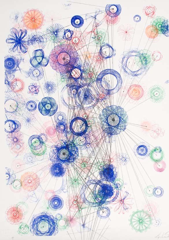
21 Lyndi Sales pacographbubble litho 48 x62 cm Mark Hosford Brain Eater II zeefdruk, silkscreen 61 x78 cm 21

22 22

23 23 Caroline Coolen Spitsbergen litho 62 x 146 cm

24 Susan Goethel Campbell Geyser field #2 hoogdruk, reliefprint 53 x 66,5 cm 24

25 25 Diyan Achjadi untitled zeefdruk, silkscreen 48 x 63,5 cm

26 Koenraad Dedobbeleer detail installatie, instalation detail litho 40 x 30 cm detail installatie, instalation detail litho 89 x 73 cm 26
27 27

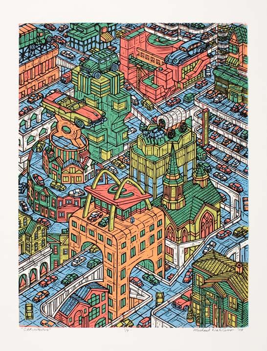
28 Art Werger Over London II diepdruk, etching, 31,5 x 40 cm Michael Dalcerro carchitecture houtsnede, woodcut, 38 x 50 cm 28
29 29

30 Beauvais Lyons Ex Libris kasterlee Zoo: Konijn Slang litho, 38 x 51 cm 30

31 31 Boyce Kit Battle houtsnede, woodcut, 46 x 56 cm


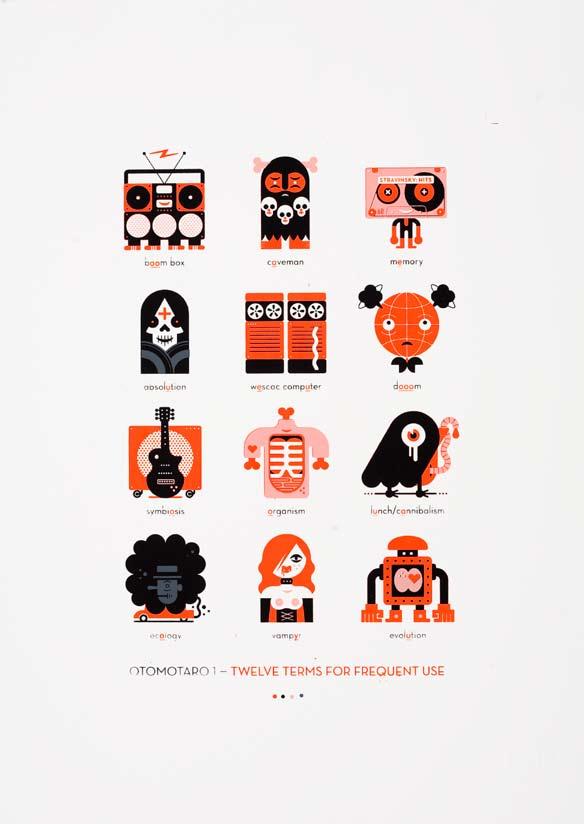
32 Daniella Deeg & Cynthia Lollis Tapetenwechsel / Change of scenery zeefdruk, silkscreen, 21 x 28,5 cm Steve Reggers Otomotaro zeefdruk, silkscreen, 20 x 28 cm 32
33 33

34 Joris Martens shifting grounds/growing Fields/stages litho, 28,6 x 43,5 cm 34

35 35 Goedele Peeters EBB litho, 60 x 80 cm
36 36
 collograph - chine collé, 5 x 5 cm")
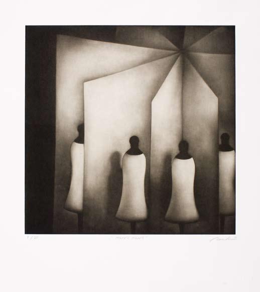
37 Kouki Tsuritani mary s heart mezzotint - chine collé, 36,5 x 36,5 cm Eunice Kim five Elements (fire) collograph - chine collé, 5 x 5 cm 37

38 Yunju Hwang Meeting sky monotype, 15 x 26 cm 38

39 39 Jeanne Hoffman Brabo and the Giant litho, 30 x 50 cm
40 40


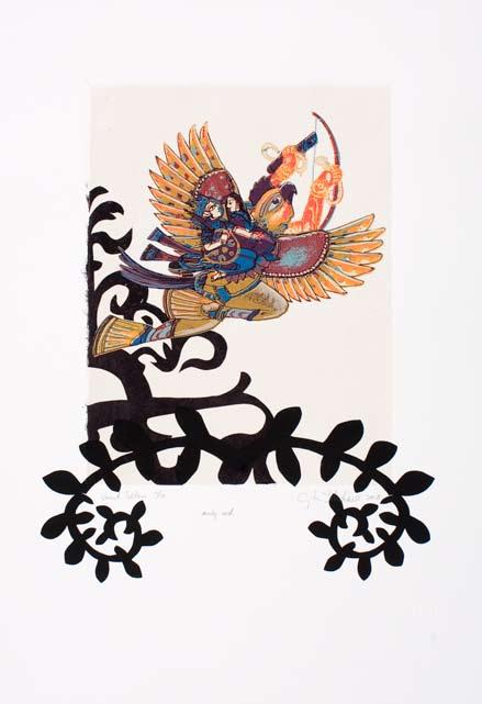
41 Cynthia Dinan Mitchell Newly wed zeefdruk, silkscreen, 38 x 57 cm Els Ceulemans untitled zeefdruk, silkscreen, 37 x 90 cm 41
42 42
43 CURATORPROJECTEN / CURATORIAL PROJECTS 43
44 Het Frans Masereel Centrum organiseert sinds 2007 ook eigen producties. Met een budget gegenereerd door de verblijfonkosten die de kunstenaars betalen(75 euro/ week) wordt er een externe curator aangetrokken om een project te realiseren, in 2008 konden we kennismaken van het eerste project waarin Steven Op de Beeck 9 jonge kunstenaars betrok die voor een periode van twee weken aan de slag gingen in de ateliers van het FMC. Met de nodige begeleiding en besprekingen kwam er naast individuele werken ook een boek tot stand dat het 35 jaar bestaan van het FMC huldigde. In 2008 werd ook het project van Koen Leemans opgestart dat zal worden voorgesteld in september 2009 in de Garage te Mechelen. The Frans Masereel Centre (FMC) has been organising its own yearly productions since Using a budget of accumulated living expenses paid for by the artists (75 euro/week), an external curator is invited to realise a project, the first of which was presented in Steven Op de Beeck s project involved 9 young artists working in the FMC studios for a period of two weeks. The guiding assistance and discussions lead to various individual works as well as a book commemorating the 35th anniversary of the FMC. Koen Leenmans project was launched in 2008 and will be presented at the Garage in Mechelen (Malines) in PROJECT 35 JAAR FRANS MASEREEL CENTRUM In 2007 kwam de vraag van Dhr. Jan Verlinden om een project op te zetten voor het 35 jarig bestaan van het FMC, meer bepaald om een tentoonstelling samen te stellen. We waren rond die tijd in gesprek over de structurele samenwerking tussen FLACC, JVE en FMC waarbij onze faciliteiten en expertise gemeenschappelijk worden ingezet. In de geest van de werking van FLACC en vanuit de uitzonderlijke accommodatie van het centrum leek het een uitdaging om een aantal beeldende kunstenaars uit te nodigen voor een gezamenlijk werkverblijf in Kasterlee. Enerzijds stelde het de kunstenaars in de mogelijkheid kennis te maken met een aantal grafische technieken en anderzijds biedt een gezamenlijke residentie ook mogelijkheden om elkaars praktijk af te toetsen. Een boek, als fundament van de drukkunst, was het vooropgezette doel. We hebben resoluut voor een kunstenaarsboek gekozen waarbij de experimentele publicatie ook als een autonoom werk kan fungeren. De selectie van de kunstenaars is een persoonlijk en uiteraard intuïtief gegeven waarbij ik een evenwicht heb gezocht tussen enkele mensen die al een interessant traject achter de boeg hebben en een aantal erg jonge kunstenaars die nog weinig weet hadden van de werking en het bestaan van het FMC. Belangrijkste criterium was een affiniteit vanuit hun werk met het grafische medium. Daar bovenop was er een erg interessant kader voorhanden dat ik de kunstenaars kon aanbieden om mee aan de slag te gaan. Naast de faciliteiten heb je ook de context van het centrum, de politiek, sociaal en geografische context, maar ook de geschiedenis van 35 jaar FMC en het historische gewicht van de grafische kunsten. Ook inhoudelijk zijn er een aantal thema s die aansluiten bij het grafische medium, en getoetst aan vandaag een startpunt konden vormen voor het project: Het continue spanningsveld tussen kopie en authenticiteit, de spiegeling als wezenlijk onderdeel van het procédé de handeling van het drukken an sich (het operationele en het repetitieve), het herdenken en positioneren van begrippen als oplage, editie en distributie, Na twee weken Kasterlee was de eerste puzzel gemaakt van het boek en werden de individuele contributies voorgelegd. Toen startte een tweede fase, nl de effectieve vertaling naar één gezamenlijk boek. In samenspraak met de kunstenaars en Luc Derycke, vormgever van het boek, zijn heel wat oefeningen gemaakt om een publicatie te maken waarbij de afzonderlijke bijdragen elkaar konden aanvullen en versterken, waarbij in z n totaliteit ook een nieuwe betekenislaag kon worden toegevoegd. Een laatste dappere etappe, was de interventie van Nico Dockx in het boek waarbij een aantal pagina s radicaal en manueel zijn gezeefdrukt over de industriële druk heen en ook Mira Sanders heeft nog een laatste urgente touch toegevoegd. Het boek is wat het is, en kan evengoed doorbladerd worden met de snelheid en luchtigheid van een magazine. In 2007, Mr. Jan Verlinden proposed to set up a project commemorating 35 years FMC, in the form of an exhibition. At that time we were discussing the structural collaboration between FLACC, JVE, and FMC which would imply the joint use of our facilities and expertise. It would be challenging to invite a number of artists for a joint working stay in Kasterlee. It would give the artists the opportunity to get acquainted with a variety of printmaking techniques, and the joint residency would offer possibilities to compare each other s individual art practices. A book, the fundamental base of the printing art, was the final goal. We opted for an artist s book, the experimental publication alternatively serving as an autonomous work. 44

45 Not a catalogue showing reproductions of works but as direct a work as possible. The selection of artists is a personal and indeed intuitive act in which I have tried to find a balance between a number of people with an interesting past trajectory and a number of very young artists with very little knowledge of the existence of the FMC. The most important criterion was the apparent affinity with the graphic medium expressed in their work. There was a very interesting conceptual framework for the artists to work with. Aside from the facilities there is also the context of the centre, the political, social, and geographical context, and also the history of 35 years FMC and the historical significance of the graphic arts.content-wise there are also a number of issues connected to the graphic medium which can be used held up against the present-day situation as a starting point for the project: the continuous tension field between falsification and authenticity; mirroring used as a principal element of the technique, the act of printing in itself (the operational and repetitive elements); the re-evaluation an repositioning of concepts such as circulation, edition, and distribution, After two weeks in Kasterlee the first rough version of the book was produced and the individual contributions were presented.the second phase, more specifically the actual edition of the collective work. Together with the artists and Luc Derycke, designer of the book, a large number of attempts were made to produce a publication in which the individual contributions can complete or reinforce each other, but which can also present a new layer of meaning as a whole. this book is not just a temporary or intermediate solution.a final and brave stage was Nico Dockx s intervention which consisted of a radical and manual silk-screening over the industrially printed pages, and Mira Sanders also added a last and urgent touch. The book is what it is, and no possible explanation can do it justice. You can also feel free to quickly and casually leaf through the book as if it were a magazine. Steven Op de Beeck 45


46 Koen Leemans (CC Mechelen) selecteert 6 kunstenaars om zich te verdiepen in het Grafisch medium tijdens een residentie op het FMC Om de dynamiek van de grafische kunst en van het Masereelcentrum tout court bij een breder kunstenaars publiek bekendheid te geven werd er in 2007 voor het eerst een curatorproject opgestart. In 2008 gaat het Frans Masereel Centrum op hetzelfde elan verder. Er werd een tweede traject opgezet en met Koen Leemans (Cultuurcentrum Mechelen, De Garage, ruimte voor actuele kunst) een nieuwe coördinator aangesteld. Terwijl er in het eerste project vooral werd gewerkt met jonge kunstenaars ligt de focus nu op beeldende kunstenaars die al een rijk oeuvre hebben opgebouwd in de voorbije tien à vijftien jaar. Zes kunstenaars werden aangesproken: Ronny Delrue, Honoré d O, Kendell Geers, Vincent Geyskens, Tina Gillen en Pieter Vermeersch. Met hen zal in november 2008 een intensieve onderzoek- en werkperiode opgestart worden. Een centrale vraag die aan deze kunstenaars wordt gesteld is of het medium grafiek een rol van betekenis kan spelen in de wereld van de hedendaagse kunst in het algemeen en meer specifiek in de context van het eigen werk. Elke kunstenaar zoekt binnen de eigen artistieke praktijk naar de relevantie en actualiteit van de grafiek. Hoe kan vrije grafiek als beeldtaal worden geplaatst binnen een actuele beeldende cultuur? Sommige kunstenaars hebben vanuit het gekozen medium of het eigen werk een directe link naar het grafische beeld. Enkelen werkten al regelmatig in diverse grafiekdisciplines terwijl het voor anderen dan weer de eerste keer zal zijn, na hun artistieke opleiding, dat ze zich aan de vrije grafiek begeven. Een deel van de kunstenaars heeft een duidelijk beeld voor ogen en zal dan ook erg doelgericht kiezen voor een bepaald procédé en specifieke techniek om het gewenste resultaat te bereiken. Anderen stellen zich onderzoekend op en zullen zich in de totstandkoming van het grafische werk veeleer laten leiden door de complexiteit en eigenheid van de verschillende drukprocessen. In de publicatie en de tentoonstelling die met dit project gepaard zullen gaan, wordt als vertrekpunt het materiaal gebruikt dat tijdens de residentie in het Masereelcentrum werd gerealiseerd. Het grafische werk zal in dialoog geplaatst worden met het recente oeuvre van de kunstenaars, aangevuld met enkele kunstkritische en beschouwende teksten. Het boek zal worden gepresenteerd op het Frans Masereel Centrum. In het najaar van 2009 organiseert Cultuurcentrum Mechelen een tentoonstelling met werk van de zes kunstenaars. 46


47 Koen Leemans (CC Mechelen) invites 6 artists to investigate the graphic medium during a residency at the FMC In order to promote the advancements of the graphic arts in general and the Masereel centre in specific to a wider group of artists, an assignment was given for the first time in 2007 to an external curator. The Frans Masereel Centre will follow the same vigorous course in A second trajectory is worked out and a new coordinator, Malines Cultural Centre, De Garage, space for contemporary art, is appointed. While the first project mainly focused on young artists, the second project is concentrated around visual artists who have built a rich oeuvre over the past ten to fifteen years. Six artists are invited: Ronny Delrue, Honoré d O, Kendell Geers, Vincent Geyskens, Tina Gillen and Pieter Vermeersch. An intensive research and work period with the aforementioned artists will commence in November A central question posed to the artists is whether the graphic medium can play an important part in the contemporary art world in general, and also in the context of their personal work more specifically. Each artist investigates the relevance and contemporaneity of the graphic medium in his or her own art practice. How can graphic art be situated as visual language in the contemporary visual culture? Some of the artists work or chosen medium has a direct link to the graphic image. Some have created work within diverse graphic disciplines while others will approach the graphic arts for the first time since their art school training. A number of these artists have a clear preconceived idea and will purposely choose a specific technique to obtain the desired result. Others are more investigative and will be guided in the elaboration of their graphic work by the complexity and specificity of the various printing processes. The publication and exhibition coupled to this project will centre on the material that was realised during the residency at the Masereel centre. The graphic works will be placed in dialogue with the more recent oeuvre of the artists, together with a number of additional art critical and reflective texts. The book will be presented at the Frans Masereel Centre. In the fall of 2009 the Cultuurcentrum Mechelen (Malines cultural centre) will organise an exhibition with works by the six artists. Koen Leemans 47
48 48
49 PROJECTEN/PROJECTS FMC

50 Cynthia Lolies & Daniella Deeg Tapetenwechsel/Change of Scenery 2008, Edition 12 Prints 28 x 40 cm (11 x 15 Ÿ inches) Box 28.5 x 21 x 2.3 cm (11 Œ x 8 œ x 1 3/16 inches) Screenprint on Simili Japon and color laser prints on Zanders Gohrsmühle, and greyboard box 50
51 Tapetenwechsel/Change of Scenery Tapetenwechsel/Change of Scenery is een reeks van negen gevouwen prints, dubbelzijdige seriegrafieën en ingelijmde kleuren laser prints, samengebracht als een losbladig boek. De tekeningen en foto s werden door de kunstenaars Daniela Deeg en Cynthia Lollis gemaakt tijdens hun gezamenlijke buitenlandse reizen. De beelden behandelen de verrassende culturele verschillen in de uitdrukkingen in de moedertaal van de kunstenaars, respectievelijk Duits en Engels. Zoals bijvoorbeeld: kalter kaffee [cold coffee] / old hat, kinderleicht [child simple] / piece of cake, in die nesseln setzen [to sit in nettles] / in hot water, weisse mäuse sehen [to see white mice] / seeing pink elephants, in den sauren apfel beissen [to bite a sour apple] / bite the bullet, ein loch in den bauch redden [to talk a hole in one s stomach] /talking one s head off, ein katzensprung [a cat s leap] / a stone s throw away, zwei fliegen mit einer klappe schlagen [to kill two flies with one swatter] / killing two birds with one stone, dasselbe in grün [same thing in green] / six of one, half dozen of the other Tapetenwechsel/Change of Scenery is a suite of nine folded prints, double-sided serigraphs, plus tipped-in colour laser prints, presented together as a loose-leaf book. The drawings and photographs were made the artists, Daniela Deeg and Cynthia Lollis, while travelling together abroad. The imagery deals with the surprising cultural differences of idiom usage in the artists native languages: German and English respectively. Such as: kalter kaffee [cold coffee] / old hat, kinderleicht [child simple] / piece of cake, in die nesseln setzen [to sit in nettles] / in hot water, weisse mäuse sehen [to see white mice] / seeing pink elephants,in den sauren apfel beissen [to bite a sour apple] / bite the bullet, ein loch in den bauch redden [to talk a hole in one s stomach] /talking one s head off, ein katzensprung [a cat s leap] / a stone s throw away,zwei fliegen mit einer klappe schlagen [to kill two flies with one swatter] /killing two birds with one stone, dasselbe in grün [same thing in green] / six of one, half dozen of the other 51
52 Woord & beeld, hout & loof - Word & image, wood & leaves In de geschiedenis van de beeldende kunst is het geschreven woord Beurtelings gezocht en gemeden. Woord en beeld hebben zich altijd vreemd tegenover elkaar gedragen. De wederzijdse verhouding van deze kunstige disciplines is vrij complex. Poëzie en beeldende kunst staan vaak tegenover elkaar als water en vuur, als kat en hond. Maar soms ook als onafscheidelijke geliefden die elkaar voortdurend oproepen, elkaar blijven vertrouwen; als hout en loof. In die zin is de titel van dit project, van boek en tentoonstelling, ook goed gekozen. Beide hebben elkaar nodig want er is geen schilderij waarin de wereld niet op de een of andere manier wordt verdicht, zoals er ook geen gedicht bestaat waarin niets wordt verbeeld. Maar om kunst te worden en niet het illustratieve prentje bij een tekst of het betweterige versje bij een beeld, moeten ze wel op eigen poten staan. Waar stoelt dan de bewering op dat het twee totaal van elkaar verschillende disciplines zijn? Alleen op het feit dat beeldende kunst zich in de ruimte situeert: en bijgevolg in één oogopslag is te vatten, terwijl poëzie een ontmoeting is in de tijd, de tijd van het lezen? Dit is een ogenschijnlijk verschil want om een beeld in je op te nemen en er iets of wat van te begrijpen, heb je ook tijd nodig. En een tekst kan je ook in één oogopslag vatten en beweegt zich ook in de ruimte als klank of teken. Dus dat is maar een wankele argumentatie. Als we terugkeren naar de oudheid, dan blijkt het dat er toen evenmin eenduidigheid over bestond. Er was het ut pictura poesis van de Romeinen dat door Plautus aan Simonides werd toegeschreven, dichtkunst zij als schilderkunst, wat maar al te graag werd geciteerd of uit de context gelicht als het er op aankwam een tegenargument te vinden voor de suprematie van de literatuur. Zo werd het in heel wat renaissancetraktaten aangehaald als tegenpool van de allesoverheer sende poëzie. In wezen gaat dit Ut pictura poesis terug op een descriptieve en imitatieve benadering van kunst. In zijn traktaat over de schilderkunst schrijft Lodovico Dolce midden 16& eeuw dat de nabootsing van wat aan ons verstand verschijnt ook tot de kunst van de dichter behoort, en niet alleen datgene wat hem voor ogen komt. Ook de taal wordt gezien als een instrument waarmee men uitbeeldt. Poëzie is woordkunst maar meestal spreekt de lezer de woorden nooit uit. Het gedicht wordt meestal geen klank want het lezen beperkt zich tot het zien van grafische symbolen. Dit is m.i. waar in de klassieke retorica wordt naar verwezen als de noodzakelijke band tussen het gehoor en het gezicht. Volgens die theorieën was het poëtische beeld altijd een substituut van het visuele en tezelfdertijd gaf het er vorm aan. Sinds de opkomst van de boekdrukkunst is de visuele factor in de literatuur voor goed ondenkbaar geworden. Deze toelichting bij de historische controverse wil ik graag afronden met een voorbeeld uit de 17de eeuw. In zijn emblematabundel De gulden Winckel noemt Vondel beeld en woord gezusters, elkaars gelijken. Maar in een bijschrift bij een Rembrandtportret noemt hij hen rivalen omdat het beeld de stem ontbeert. Sindsdien is de relatie tussen poëzie en beeldende kunst alsmaar belangrijker geworden. In de moderne tijd komt dan de echte kruisbestuiving van de twee disciplines. Experimenten van avant-gardisten met collages waar zowel beeldende kunstenaars zich op gaan storten die taal en teken in hun werk integreren als dichters die hun teksten letterlijk als beeld gaan verwerken. Samenwerkingen vierhandig van schilders met schrijvers. En die ook in hun werk laten samenkomen. De Engelse prerafaëlitische kunstenaar Dante Gabriël Rossetti bijvoorbeeld schilderde niet alleen vaak literaire thema s, hij verwerkte ook teksten in de schilderijen of in de omlijstingen. William Blake verwerkte zijn gedichten in pastelkleurige tekeningen en motieven. Later zijn er andere dubbelbegaafde kunstenaars als Jean Cocteau of Christian Dotremont die het beeld vanuit de tekst laten ontstaan. Vandaag spreekt men veeleer over interdisciplinariteit waarin dan toch weer maar eens opvalt dat de visuele verschijningsvorm en de inhoudelijke betekenis van het woord vaak tegen elkaar worden uitgespeeld. Jan Fabre is een goed voorbeeld van een hedendaags kunstenaar die talige elementen en structuren in z n beelden en voorstellingen integreert. Behalve degenen die in de loop der tijden hebben gewezen op de grondige verschillen tussen woord en beeld en er traktaten over hebben geschreven, zijn er ook theoretici geweest die juist de overeenkomsten tussen beide hebben gezien. Zij wijzen op het bedrieglijk spel zowel van woord als beeld; op de dubbelzinnigheid. De schrijver verleidt de lezer om het geschrevene te vergelijken met de werkelijkheid buiten de tekst. Anderzijds schept hij of zij een wereld die alleen uit woorden bestaat en allen binnen de realiteit van de tekst volledig op zich staat. Toch is literatuur nooit een weergave van de werkelijkheid. Ze voegt er iets aan toe; het is een uitbreiding van de werkelijkheid. De werkelijkheid doet zich aan ons voor in beelden. En wij vormen ons een beeld van de werkelijkheid. De schrijver voegt er nieuwe beelden aan toe. En dat doet ook de beeldend kunstenaar, maar hiermee is dan ook duidelijk dat het domein van de beelden geen monopoly is van de beeldende kunst. Heel wat dichters schrijven dus ook gedichten over bestaande kunstwerken. Het schilderij van Picasso man met de blauwe gitaar was voor de Amerikaanse dichter William Carlos Williams aanleiding om eer een gedichtencyclus op te maken. Deze bundel The blue Guitar was voor de Britse kunstenaar David Hockney dan op zijn beurt de aanleiding voor een reeks tekeningen en etsen waar-moet het nog worden vermeld ook naar Picasso wordt verwezen. Beeld en verbeelding horen linguïstisch dus niet toevallig bij elkaar. 52
53 Throughout the history of the visual arts, the written word has alternatingly been welcomed and avoided. Word and image have always stood at a strange distance from one another. The mutual relation between these artistic disciplines is rather complex. Poetry and visual art often oppose each other like water and fire, like cats and dogs. But sometimes they are as inseparable lovers who continuously court each other, trust each other; like wood and leaves. The title of this project, and of the book and the exhibition, is well chosen in this sense. Both need each other; there is not a single painting that is not composed poetically, just as there is not one poem which does not suggest visual imagery. But to avoid being an illustrative image next to a text or a clever little verse next to a picture, they have to stand on their own. But what is the alleged notion that they are two radically different media based on? On the mere fact that visual art is set in space and can therefore be grasped at a glance, whereas poetry is a meeting in time, the time of the reading? This is a superficial difference because time is also needed to assimilate and understand an image. A text can also be read at a glance and has a similar spatial presence as a sound or a sign. So this is but a shaky argument. Even in Antiquity there seems to have been very little certainty about the issue. The Roman Ut pictura poesis attributed by Plautus to Simonides as is painting so is poetry - was often quoted or taken out of context when an argument against the supremacy of literature had to be formulated. In this way, it appears in many a renaissance treatise as the antipode of the predominating poetry. In essence, Ut pictura poesis reverts to a descriptive and imitative approach of art. In his mid-sixteenth century essay on painting Lodovice Dolce writes that the imitation of what appears to our intellect is also part of the poet s art, and not solely that which appears in front of the eyes. Similarly, language is also considered an instrument for expression. Poetry is literary art although the reader rarely pronounces the written words. The poem is usually not translated into sound because reading is limited to the observation of graphic symbols. This is what, in my opinion, Classical Rhetoric refers to as the necessary link between hearing and seeing. According to these theories the poetic image was always a substitute for the visual image which it simultaneously also gave form. Since the advent of book printing, the visual element in literature has been barred forever. I wish to round off this commentary of the historical controversy with an example from the 17th century. In his emblem book Den Gulden Winckel, Vondel calls images and words sisters - equals. But in a caption to a Rembrandt portrait he calls them rivals because the image lacks a voice. Since then the relationship between poetry and visual art has become increasingly more important. The Modern Times will ultimately bring the true cross-pollination between the two disciplines. Avant-garde experiments with collages elaborated by both visual artists who integrate sign and language in their works and poets who literally process their texts as images. Four-handed collaborations between painters and writers but also artists who are equally at ease in both disciplines, and bring them together in their work. The English pre-raphaelite artist Dante Gabriël Rossetti for instance, not only regularly painted literary themes, but also incorporated texts in the paintings or frames. William Blake incorporated his poems in pastel-coloured drawings and motifs. Later, other multi-talented artists such as Jean Cocteau or Christian Dotremont create images from within the text. Presently this is considered interdisciplinarity, although it is remarkable that the visual appearance and the significance of the word are often played off against each other. Jan Fabre is a fine example of a contemporary artist who incorporates language-related elements and structures in his images and performances. Except for those who have, throughout history, pointed out - and written treatises about - the profound differences between word and image, there are also theoreticians who have observed the similarities between both. They point out the deceptive game of both image and word; ambiguity. The writer seduces the reader to compare what is written to the reality outside the text. On the other hand, he creates a world that solely consists of words and only exists autonomously within the reality of the text. However, literature is never a representation of reality. It adds to reality; it is an extension of reality. Reality reveals itself to us by means of images. And we construct an image of reality. In turn, the writer adds new images. And so does the visual artist, which clearly shows that the visual domain is not owned by the visual arts exclusively. Many poets write poems about existing works of art. A famous example: Picasso s painting Man with Blue Guitar inspired the American poet William Carlos Williams to write an entire anthology devoted to this work. The volume The Blue Guitar in turn motivated the British artist David Hockney to produce a series of drawings and etchings which also need it be said refer to Picasso. Image and imagination are not just linguistically related. Johan Van Cauwenberghe 53

54 54
55 Cakehouse in a Smurph Holl Frans Masereel Centrum - Kasterlee - April 2007 Cakehouse is het kunstenaarsinitiatief van Michèle Matyn en Lieven Segers. De vzw werd opgericht in 2007 en heeft als doelstelling het organiseren van tentoonstellingen, het produceren en uitgeven van kunstenaars edities (films, documentaires, boeken, magazines, t-shirts, enz.), en het organiseren van samenwerkingen tussen verschillende kunstenaars. Tijdens een werkverblijf in het Frans Masereel Centrum in April 2007 zijn Michèle Matyn en Lieven Segers een samenwerking aangegaan met elkaar. De twee kunstenaars hebben deze periode opgevat als een retraite waardat met een verhoogde vorm van concentratie werd bekeken wat Cakehouse zou kunnen zijn en in welke gedaante dat Cakehouse zich in de toekomst zou kunnen manifesteren. Er werden op voorhand geen afspraken of richtlijnen uitgetekend hoe dit zelfonderzoek juist zou moeten verlopen. Alles ontstond ter plaatse met als voornaamste grondstof uitdagingen die aan elkaar werden gesteld. Deze uitdagingen in de vorm van intensieve tekensessies, fotosessies, graveer-discussies tijdens tafelmomenten, en een dagboek gevuld met one-liners kregen een grafische verwerking via de verschillende druktechnieken van het Frans Masereel Centrum. Cakehouse is the name of the artist collective of Michèle Matyn and Lieven Segers. The nonprofit association was established in 2007 and aims to organize exhibitions, produce and publish artist s editions (films, documentaries, books, magazines, t-shirts, etc.), and organise collaborations between various artists. Michèle Matyn and Lieven Segers started collaborating during a residency at the Frans Masereel Centre in April Both artists saw this as a period of reflection, a time of heightened concentration during which they considered what Cakehouse could mean and in which form it could manifest itself in the future. There were no guidelines nor agreements specified on how this introspection should proceed. Everything originated on-site, the challenges posed between them serving as principal raw material. The challenges in the form of intensive drawing sessions, photo shoots, engraving-related discussions at the table, and a diary filled with one-liners were processed through the 55
56 Peripheral Press: Love - Death - Life - Soul Peripheral Press is een open groepsproject dat de creatie van hedendaags drukwerk door professionele kunstenaars die hoofdzakelijk in media buiten de traditionele grafiek werken beoogt. Periphery (periferie) verwijst naar het periferisch zicht, en het is juist dit randverschijnsel dat binnen de creatieve actie meestal het meest interessante werk oplevert. Het project is gestart met een groep schilders, installatie-, video-, en mixed-mediakunstenaars uit Berlijn, Nederland en de Verenigde Staten die allen in het Frans Masereel Centrum hebben samengewerkt. In de praktijk focust de nieuwe groep op experimentatie binnen de traditionele werkvormen. De portfolio Love-Death-Life-Soul (Liefde-Dood-Leven-Ziel) was de enige richtlijn die werd gebruikt tijdens de creatieperiode met als doel de kunstenaars zoveel mogelijk conceptuele ruimte te laten. Het uiteindelijke archief van de portfolios is een weergave van deze creatieve actie. De kunstenaars die hebben meegewerkt aan deze portfolio zijn Tania Bedriñana, Dustyn Bork, Lou Joseph, Michael Markwick, Mary Robinson en Misha (Michael) Shenbrot. De collectieve groep internationale kunstenaars, Peripheral Press, werd geselecteerd door kunstenaar Michael Markwick voor een grafisch project dat resulteerde in de productie van deze portfolio. Love-Death-Life-Soul is een kollektie van 10 unieke portfolios (kunstmappen) uitgegeven als een reeks variabele edities. De compilaties bevatten hoogdruk, monoprint, seriegrafie en intaglio. Peripheral Press is an open group-project that seeks to create contemporary prints with professional artists who work primarily in other media besides traditional printmaking. Periphery refers to the edge of vision, and it is this peripheral element that often creates the most interesting work in creativity.the project began with painters, installation-, video-, and mixed-media artists from Berlin, the Netherlands, and the U.S.A., all working together at the Frans Masereel Centrum. In practice, the new group stresses experimentation within traditional matrices. The particular portfolio Love-Death-Life-Soul was the only parameter to the creative period, seeking to allow the artists as much conceptual space as possible. The final archives of the portfolios are records of this creativity. Participating artists for this portfolio are Tania Bedriñana, Dustyn Bork, Lou Joseph, Michael Markwick, Mary Robinson and Misha (Michael) Shenbrot. The collective group of international artists, Peripheral Press, was selected by artist Michael Markwick for a printmaking project that culminated in the production of this portfolio. Love Death Life Soul is a collection of 10 unique portfolios that exist as sets of variable editions. The compilations include relief, monoprint, serigraphy, and intaglio. Michael Markwick 56

57 GEK OP QUEBEC - Transbordement Gedurende de voorbije 6 jaar heeft het Frans Masereel Centrum een uitwisseling gemaakt met het atelier Engramme, dat deel uitmaakt van het grotere Méduse centrum, waardoor er een constante uitwisseling kon gebeuren van kunstenaars tussen Québec en Vlaanderen. De focus van de uitwisseling is gespitst op Kunstenaars die een interessant Grafisch project kunnen voorleggen. De selectie hiervoor gebeurd door de selectiecommissie van het FMC op basis van selectiecriteria gelijklopend met de selectiecriteria voor het bekomen van een residentie op het FMC. For the past 6 years, the Frans Masereel Centre has been running an exchange programme with the Engramme studio, which is part of the larger Méduse Centre. This has led to a consistent artist exchange between Québec and Flanders. The exchange programme focuses on artists who present an interesting graphic project. The FMC selection committee is responsible for the selection which is juried according to the same criteria as for the FMC residency application. 57
58 Samenwerkingsverbanden FLACC en Jan van Eyck Academie Het Frans Masereel Centrum heeft samen met Jan van Eyck Academie (Maastricht) en FLACC een structurele samenwerking opgezet. De samenwerking met FLACC vertrekt vanuit de inzet van complementaire faciliteiten en uitwisseling van expertise op het vlak van analoge en digitale grafische producties. De samenwerking met Jan van Eyck Academie is op organisatorisch niveau waarin het uitwisselen van expertise op gebied van editing, publishing en distributie centraal staan. De infrastructurele middelen worden geïnventariseerd en jaarlijks worden de investeringsplannen op elkaar afgestemd. Pépinières européennes pour jeunes artistes. De Pépinières Européennes pour jeunes artistes worden gesteund door het Franse Ministerie voor Cultuur en Communicatie, het Ministerie voor Jeugd en Sport, de Europese Commissie en de ministeries en instellingen van de partnerlanden. Zij opereren binnen een ruim netwerk van 170 creatieplaatsen in 27 landen in Europa en Québec. Het FMC maakt als Vlaamse instelling deel uit van dit Europese netwerk van Residentieplaatsen in Europa dat de mogelijkheid biedt aan jonge kunstenaars om een kandidatuur in te dienen. Bij selectie geeft dit recht geeft op een volledig gesubsidieerde beurs voor de periode van 3 maanden in het Frans Masereel Centrum. In 2008 werd Maria Francisca Sanchez geselecteerd voor het Frans Masereel Centrum (residentieperiode 2009). Engramme (Québec) Gedurende de voorbije 6 jaar heeft het Frans Masereel Centrum een uitwisseling gemaakt met het atelier Engramme, dat deel uitmaakt van het grotere Méduse centrum, waardoor er een constante uitwisseling kon gebeuren van kunstenaars tussen Québec en Vlaanderen. De focus van de uitwisseling is gespitst op Kunstenaars die een interessant Grafisch project kunnen voorleggen. De selectie hiervoor gebeurd door de selectiecommissie van het FMC op basis van selectiecriteria gelijklopend met de selectiecriteria voor het bekomen van een residentie op het FMC. Haldenstein De afgelopen periode van 3 jaar kon er telkens een team van beeldend kunstenaar en auteur gebruik maken van de infrastructuur en residentiemogelijkheden in het FMC en de ateliers in Haldenstein om een project te realiseren binnen dit samenwerkingsverband. De selecties werden gemaakt door vzw Litergra. Als resultaat werd er een publicatie en tentoonstelling gerealiseerd die werden getoond in beide centra. Dit project werd mogelijk gemaakt dankzij overeenkomsten tussen beide ateliers, de provincie Antwerpen en het Kanton Graubunden in Zwitserland. Het laatste onderdeel van dit 3 jarig project tussen beeldende kunstenaars en auteurs zal plaatsvinden in
59 Collaboration alliances FLACC and Jan van Eyck Academy The Frans Masereel Centre has established a structural alliance with the Jan van Eyck Academy (Maastricht) and FLACC. The collaboration with FLACC is based on the allocation of complementary facilities and the exchange of expertise concerning analogue and digital graphic productions. The collaboration with the Jan van Eyck Academy is mainly on an organisational level where the exchange of knowledge concerning editing, publishing, and distribution is paramount. The joint infrastructural means are inventoried and investment plans are adjusted on a yearly basis. Pépinières européennes pour jeunes artistes. Pépinières européennes pour jeunes artistes are supported by the French Ministry for Culture and Communication, the Ministry for Youth and Sports, the European Commission, and the ministries and institutions of the partner countries. They work with a large network of 170 creation places in 27 countries in Europe and Québec. As a Flemish organisation, the FMC forms part of this European network of Residencies in Europe which gives young artists an opportunity to apply for a residency. Selected applicants are granted a full scholarship for a residency of 3 months at the Frans Masereel CentreThe applicant selected for the Frans Masereel Centre) in 2008 was Maria Francisca Sanchez (period of residency in 2009). Engramme (Québec) For the past 6 years, the Frans Masereel Centre has been running an exchange programme with the Engramme studio, which is part of the larger Méduse Centre. This has led to a consistent artist exchange between Québec and Flanders. The exchange programme focuses on artists who present an interesting graphic project. The FMC selection committee is responsible for the selection which is juried according to the same criteria as for the FMC residency application. Haldenstein In the last 3 years, teams consisting of a visual artist and an author were given use of the facilities and residency accommodations of the FMC and the Haldenstein studios to jointly realise a project in the frame of this collaboration. Selections were made by the Literga non-profit association. The resulting realisations, a publication and an exhibition, were presented in both centres. This project was made possible by agreements between both studios, the province of Antwerp, and the canton of Graubunden in Switzerland. The final part of this three-year project involving visual artists and authors will take place in Ivan Durt 59
60 60
61 61 WORKSHOPS 2008
62 62
63 In 2008 werden er twee workshops georganiseerd. De workshop in de zomer van 2008 werd geleid door Endi Poskovic(geboren in Sarajevo, wonend in VS). De workshop houtsneden olv Endi Poskovic liet de deelnemers kennismaken met de toegeëigende methodes die Poskovic hanteert. Naast verschillende technische aspecten die Poskovic met ons deelde werd er ook dieper ingegaan op de manier waarop een beeld ontstaat en vorm krijgt. De manier waarop kleur de hele dimensie en karakter van een werk kan veranderen. De herfstworkshop olv An Bellers (BE) en Marnix Everaert (BE) focuste zich op de problematiek van toxiciteit in de grafische ateliers. Er werd onderzoek gedaan naar alternatieve, non-toxische en gezondere manier van werken die de meer traditionele technieken kan vervangen of bijstaan. De mens en milieu vriendelijkere technieken is in de laatste jaren sterk in opkomst en is een must voor elk atelier. Het FMC wil hierin ook een belangrijke rol in spelen bij de ontwikkeling van haalbare en interessante alternatieven binnen deze evolutie. Two workshops were organised in The summer workshop was lead by Endi Poskovic (born in Sarajevo, lives in the US). During his woodcutting workshop, participants were able to discover Poskovic s own particular methods. Aside from the technical information Poskovic shared with us, there was an in-depth examination of how images originate and take form. The way in which colour can alter the total dimension and the character of a work. The fall workshop lead by An Bellers (B) and Marnix Everaert (B) focused on the problem of toxicity in graphic arts studios. Alternative, non-toxic, and healthy working processes that could possible replace or be used together with the more traditional techniques were investigated. Environmentally safe techniques have gained in popularity over the years and are a must for any studio. The FMC wants to play an important part in the process of the development of viable and effective alternatives. 63

64 Verslag Workshop niet-toxische diepdruk. Frans Masereel Centrum 27 oktober - 31 oktober Onder leiding van Marnix Everart en An Bellers Maandag - Dinsdag Vooreerst werden de voornaamste etstechnieken aangehaald: lijnets-harde grond, zachte grond en aquatint. De deelnemers maakten kennis met de verschillende acrylvernissen: Future/Klir/ Lascaux/ Golden... Zachte grond werd niet gevolgd in dit gamma. Een eenvoudig recept bestaande uit Charbonnel luxe c-inkt, bijenwas en colofonium werkt uitstekend, zo niet beter dan de gekende traditionele vernis-mou. Solventen zoals white spirit of petroleum werden vervangen door sla-olie of VCA en detergent (Dreft). Het niet-toxisch atelier werd uitgerust met een droogkast die instaat voor het uitharden van de vernissen. Ook is er een spuitcabine voor het aanbrengen van aquatint-spray. Demonstraties en uitleg hadden in de voormiddag plaats. Nadien was er telkens mogelijkheid tot het uitproberen van de verschillende technieken. Later in de namiddag volgde dan dikwijls nog een uitleg omtrent aquatint of gewassen grond. De deelnemers leerden zo omgaan met de verschillende materialen en technieken: aanbrengen vernis, ontvetten, uitharden, zuren in ijzerchloride, deoxideren... s Avonds werd er voornamelijk afgedrukt. Ook hierbij werden verschillende mogelijkheden afgetast. (Viscositeit inkt-diepdruk-hoogdruk-drager) Woensdag Donderdag - Vrijdag Na bespreking van de afdrukken van de voorbije dagen, kregen de deelnemers (nu reeds overtuigd van de eenvoudige basistechnieken van het niet-toxisch etsen) uitgebreid toelichting bij een aantal andere mogelijkheden, met name mezzotint met acrylvernis, carborandum print, penseelets, wasstiftmethode en suikerets (vetgrond). Ook hier werd er in de voormiddag voornamelijk uitleg en demonstratie gegeven. De deelnemers probeerden deze werkwijzen uit en combineerden ze met de eerder aangeleerde technieken. Suikerets met polymeerfilm tenslotte, werd ook aangehaald èn zeer enthousiast onthaald. Hoewel de mogelijkheden binnen deze techniek oneindig zijn, werd binnen het kader van deze workshop specifiek de nadruk gelegd op het gebruik ervan bij een zogenaamde suikerets. Vanuit de groep deelnemers werd er dan ook de vraag gesteld naar een vervolg op deze workshop, met name één die specifiek handelt over werken met photopolymeerfilm.een laatste bespreking en evaluatie van de werken leerde ons dat er tijdens deze korte week, zeer intens en hard gewerkt is. De deelnemers kunnen elk binnen hun eigen thuis-, academie- of ateliersituatie verder werken in een niet -of alleszins minder-toxisch atelier. 64

65 Report Workshop non-toxic intaglio printing. Frans Masereel Centre 27 October - 31 October Led by Marnix Everart and An Bellers Monday-Tuesday First the main etching techniques were discussed: line etching-hard ground, soft ground, and aquatint. Participants were introduced to the various acrylic varnishes: Future/Klir/ Lascaux/ Golden... Soft ground was not available in this range. A simple recipe consisting of Charbonel luxe-c ink, beeswax, and rosin works very well, if not better than the well-known traditional vernis-mou (soft ground etching lacquer). Solvents such as white spirit or petroleum were substituted by salad oil or vegetable cleaning agent and detergent (Dreft). The non-toxic workshop is equipped with a dryer which is used to harden the varnishes. There is also a spray-painting booth for the application of aquatint spray. Demonstrations and explanations were given in the morning. Afterwards, there was always an opportunity to try out the different techniques. Later in the afternoon there was another informative briefing concerning aquatint or washed ground. The participants were taught to handle the various materials and techniques: application of varnish, degreasing, hardening, acid exposure in iron chloride, deoxidising Printing mainly occurred in the evening. Different possibilities were explored at this time also. (Viscosity ink-intaglio printing-relief printing-carrier) Wednesday-Thursday-Friday After discussing the prints made in the past few days, the participants (now already convinced of the simple basic techniques of non-toxic etching) were given an extensive explanation concerning a number of other possibilities, specifically mezzotint using acrylic varnish, carborundum print, pencil etching, wax etching, and sugar-lift etching (grease ground). Like other days, explanations and demonstrations were mainly given in the morning. The participants tried out these different methods which they combined with the techniques acquired earlier. Finally, sugar-lift etching using polymer plates was discussed which was met with much enthusiasm. Although this technique offers endless possibilities, this workshop mainly concentrated its use in the case of a so-called sugar-lift. A request from the group of participants was made for a follow-up workshop, specifically one concerning working with photopolymer plates. A final discussion and evaluation of the works clearly showed that a lot of hard and intense work was done in this short week. The participants can now continue working in their own home, academy, or workshop setting in a non- or at least less toxic way. 65
66 66
67 TENTOONSTELLINGEN FMC 67
68 68
69 69 tentoonstellingen / exhibitions Er wordt jaarlijks een overzichttentoonstelling gehouden die een selectie toont van de werken die het afgelopen jaar werden gerealiseerd. Een overzichtstentoonstelling als deze geeft de bezoeker de kans een beeld te creëren van de verschillende kunstenaars die actief zijn tijdens een jaarprogramma op het FMC. Later in het jaar werd deze tentoonstelling ook getoond te Gent. In de tentoonstelling Transbordements waarin de samenwerking tussen FMC en Engramme (Québec) werd getoond werden de verschillende kunstenaars die deel uitmaakte van een uitwisselingsprogramma tussen Vlaanderen en Québec de kans gegeven om tentoon te stellen in het FMC en in het Boudewijngebouw te Brussel. Er werden tijdelijke collaboraties gesloten tussen Vlaamse en Quebequoise kunstenaars. gevormd die samen een werk realiseerde. Verder werd de tentoonstelling aangevuld door individueel werk van de kunstenaars waarin het onderzoek dat tijdens hun residentie werd gevoerd werd geconcretiseerd. De tentoonstelling en boekvoorstelling van 35 jaar Frans Masereel waarin het FMC voor het eerst op zoek ging naar een externe curator om een project te coördineren werd plechtig dor de Kabinetsmedewerker Adinda. Steven op de Beeck, artistiek coördinator van FLACC, selecteerde 9 jonge kunstenaars om een dit pilootproject te verwezenlijken. De tentoonstelling toonde naast het boek het werk dat werd gerealiseerd tijdens de residentie van de kunstenaars. In de zomer van 2008 werd de solotentoonstelling van Endi Poskovic in het FMC getoond. Poskovic liet ons kennismaken met de hoogdruk. De houtsneden die Poskovic gedurende een reeds gevulde carrière realiseerde geven een mooi beeld over de mogelijkheden die hoogdruk ons te bieden heeft. Door middel van deze vier tentoonstellingen aan te halen worden ook de voornaamste pijlers van het FMC aangeraakt. De groep van internationale residenten die jaarlijks hun werk komen realiseren op het FMC, de sterke internationale samenwerkingsverbanden die zo belangrijk zijn in een steeds groeiend netwerk waarmee het FMC verbonden is, de openheid en flexibiliteit waarmee het FMC projecten steun geeft die een nieuwe weg met grafiek wensen te bewandelen. En tenslotte de solotentoonstelling die het FMC gebruikt om kunstenaars te belichten die een voeling met het Medium grafiek hebben die uniek is in het veld. An annual retrospective is held presenting a selection of the works realised in the past year. A retrospective offers visitors an opportunity to gain insight in the work of different artists who were active during the past FMC programme. This retrospective was also presented later in the year in Ghent. The Transbordements exhibition, highlighting the collaboration between FMC and Engramme (Québec), gave the various artists who took part in the exchange programme between Flanders and Québec an opportunity to exhibit at the FMC and the Boudewijn building in Brussels. Temporary alliances between Flemish and Québécois artists were formed which resulted in a jointly elaborated work of art. The exhibition further presented individual works by the artists, showing the materialisation of the research performed during their residency. Endi Poskovic s solo show was presented at the FMC in the summer of Poskovic showed us the specifics of relief printing. The wood carvings which Poskovic has realised during his extensive career give an extensive view of the possibilities of relief printing. The four exhibitions are also a means to exemplify the basic principles of the FMC: the group of international residents who come to realize work at the FMC every year, the strong international collaborative alliances of utmost importance in the ever growing network connected to the FMC-, the openness and flexibility with which the FMC supports graphically innovative projects, and finally the solo exhibitions which are a vehicle for the FMC to turn the spotlight on artists who express a particular and unique understanding of the graphic medium.


70 Souvenirs de Sarajevo? De monumentale houtsneden van Endi Poskovic laten niemand onberoerd. De volle warme kleuren, de kronkelende zwarte lijnen en de bijna idyllische onderwerpen vormen bijzonder aantrekkelijke grafische ensembles. Hoewel geschoold in de modernste technieken kiest Poskovic, in de traditie van de grote Masereel, voor de ambachtelijke houtsnede. Met de virtuositeit van een meester snijdt hij uit het weerbarstige materiaal de decors en de landschappen waarin hij zijn verhalen wil opvoeren. Want net als Masereel is Poskovic een verteller. Hij reikt zijn toeschouwers niet alleen beelden aan maar ook tekst en taal, die hij aanbrengt in de zwarte boord onderaan de prenten. Het bezorgt zijn werk een didactische karakter. Het refereert aan schoolprenten uit de vorige eeuw waarop fragmenten uit de bijbel afgebeeld werden, aan theateraffiches uit de beste Oost-Europese traditie, aan uitvergrote verpakkingen van bloemenzaden of aan toeristische publiciteit voor een onherbergzaam werelddeel. De onderschriften in het Frans of in het Italiaans zouden op het eerste zicht de titel van het werk kunnen zijn. Maar dat zijn ze niet want elk werk heeft een andere, meer prozaïsche titel. Ze brengen de toeschouwer in verwarring zodat die niet meer weet wat er in de perceptie de bovenhand moet nemen, de tekst of het beeld. En de verwarring neemt nog toe omdat de helderheid van Poskovic lijnvoering en techniek in schril contrast staat met de mysterieuze en surrealistische sfeer die over de beelden en de landschappen hangt. 70 Uit de landschappen met vulkanen die zware rookpluimen uitbraken is niet onmiddellijk af te leiden of het hier beelden betreft uit de prehistorie of uit een nabije toekomst na een of andere ecologische ramp. De aarde kolkt van binnen en er hangt storm in de lucht. De verontrustende beelden worden wat afgezwakt door de aanwezigheid van hutjes of een gestrande ark op de voorgrond. Er valt geen mens te bespeuren. Hutjes, strandhokjes, ark, huifkar, boot, gebouw, al dan niet op wieltjes, duiken vaak op in Poskovic werk. Soms zweven ze in de ruimte, soms staan ze in een landschap op een heuveltje.. Ze bevinden zich tegen een achtergrond van sterren, bloemen, salamanders, wolken, meanderende rookpluimen of kleurrijke cirkels. Door hun kleur, hun eenvoudige vorm en hun wieltjes lijken ze op speelgoed. Ze hebben geen ramen of deuren. Hun geslotenheid bezorgt ze een onrustwekkend en dreigend aura. Uit niets blijkt dat je er in kan wonen of er tijdelijk in kan verblijven. Nergens wordt getoond dat je ermee kan reizen of dat je er vliegend mee kan wegstomen in een heelal vol psychedelische kleuren. Dit alles is onmogelijk. Ze zijn ontoegankelijk, onbewoonbaar en immobiel. Het zijn gestileerde afspiegelingen van enkele basisvormen van ons bestaan. We zien een artificiële wereld die opgebouwd is uit enigmatische, gesloten en absurde onderdelen die zich in onwezenlijke decors bevinden. Deze wereld is een metafoor voor de werkelijkheid. Ondanks de kleurige circussfeer laat de kunstenaar ons niet veel hoop. Of toch?
71 Hier kan de tekst die daarnet nog verwarring stichtte soelaas brengen. Hij biedt de mogelijkheid om de beelden in een nieuwe context te plaatsen. Poskovic gebruikt hiervoor de eenvoudige strategie die ook werd gehanteerd door de surrealisten en door René Magritte. Beeld, taal en betekenis worden zonder schijnbare relatie naast elkaar geplaatst zodat er een surrealistische situatie ontstaat. De kijker wordt verplicht na te denken over wat hij ziet en in de mogelijkheid gesteld te relativeren. Misschien wil Endi Poskovic met zijn surrealistische teksttoevoegingen juist zeggen dat wat we zien niet noodzakelijk datgene is wat we zien. Waarschijnlijk zijn de verontrustende beelden die de toeschouwer ziet net zo n verzinsels van de kunstenaar als zijn absurde onderschriften? Misschien is het kleurrijke schaakbordpatroon op het hutje, of op de ark wel belangrijker dan de ontoegankelijkheid ervan.misschien moet de tekst die Endi Poskovic onder een van zijn landschappen geplaatst heeft niet Souvenirs de l Amerique zijn, maar Souvenirs de Sarajevo. Wie zal het zeggen? La main de mon petit garçon? Endi Poskovic s monumental woodcarvings leave no one untouched. The full, warm colours, the swirling black lines, and the almost idyllic subjects create particularly appealing graphic ensembles. Although schooled in the most advanced techniques, Poskovic opts for the artisanal woodcarving in the tradition of the great Masereel. With masterly virtuosity, he carves the settings and landscapes in which his stories will be set from the unyielding material. Just like Masereel, Poskovic is a storyteller. He presents his viewer not only images but also language and texts, which he places in the black edge beneath the images. It gives the work a didactic feel. It refers to former century school pictures depicting biblical scenes, theatre posters in the best Easter European tradition, enlarged flower seed wrappers, or tourist propaganda for an inhospitable continent. At first sight, the captions in French or Italian could be read as the work s title. This is, however, not the case since every work has a different, more prosaic title. They confuse the viewer to the point where he or she is no longer certain which is the predominant element in the reading of the work, the text or the image. The clarity of Poskovic s line drawing and technique sharply contrasts with the mysterious and surrealistic atmosphere in the images and landscapes and adds to the viewer s confusion. It is impossible to tell whether the landscapes with volcanoes spewing black smoke plumes are images from prehistory or, quite contrarily, from one or the other ecological disaster in the nearby future. The earth is brewing beneath the surface and there is storm looming. The unsettling images are softened by the presence of little huts or a beached ark in the foreground. There is not a soul in sight. Huts, beach cabins, ark, chuck wagon, boat, building -with or without wheels-, are elements which often appear in Poskovic s work. Sometimes they float in space, sometimes they are set on a hill in the landscape. They are set against a background of stars, flowers, salamanders, clouds, meandering smoke plumes, or colourful circles. Their colour, simple form, and little wheels make them look like toys. They have neither doors nor windows. The fact they are closed gives them a disturbing and sinister aura. Nothing indicates that they can be lived in or that one can temporarily reside in them. There is no suggestion that they can be used to travel with or that one could use them to fly away, steaming off into a universe filled with psychedelic colours. All of this is impossible. 71

72 They are impassable, uninhabitable, and immobile. They are stylised reflections of some of the primal forms in our existence. What we see is an artificial world constructed from enigmatic, closed, and absurd parts placed in unreal surroundings. This world is a metaphor for reality. Despite the colourful circus atmosphere, the artist leaves us with very little hope. Or does he? It is exactly here that the captions which moments ago caused great confusion can bring relief. They make it possible to view the images in a new context. Poskovic utilises the simple strategy which was also used by the Surrealists and René Magritte. A surreal situation emerges as image, word, and meaning are placed together without apparent connection. The viewer is forced to reflect on what he or she sees and is given an opportunity to reevaluate his or her observation. Maybe Endi Poskovic s surrealist captions imply that what we see is not necessarily what we see. Perhaps the unsettling images which the viewer sees are just as much the artist s fabrications as his absurd captions? Maybe the colourful chequered pattern on the little hut, or on the ark, is more important than the fact they are sealed off. Maybe the caption Souvenirs de l Amerique which Poskovic has placed beneath one of his images should read Souvenirs de Sarajevo. Who can tell? La main de mon petit garçon? (The hand of my little boy?) Raf Coenjaerts 72
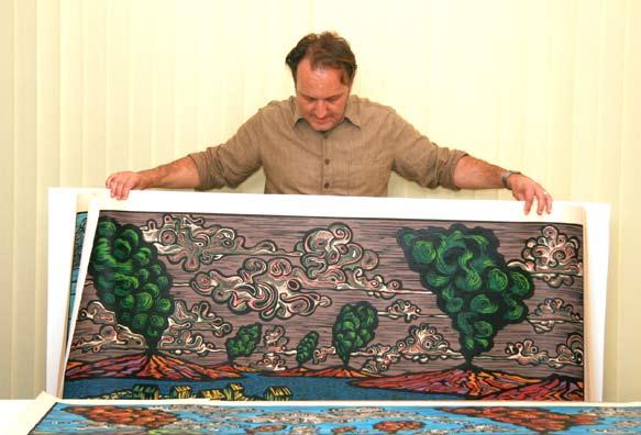
73 73